Saturday, 14 August 2010

Camera Move

For the establishing shot at the start of my film I wanted a camera move. I could have done a straight track in like my previous Haunted House shot but I had in mind something a little more dramatic.

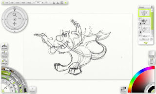
I loaded my rough storyboard image into Anime Studio and began tracing.
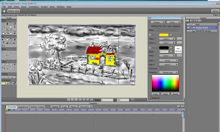

It soon became apparent that my rough storyboard image wouldn't be good enough for tracing when it came to the finer details so I created a layout drawing and continued from that tracing all the elements on to separate layers.
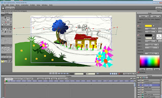
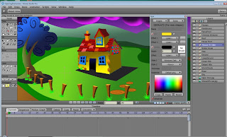
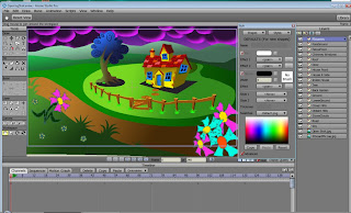

Once this was done I could construct the camera move. To start the illusion the two layers of hills on the lowest levels (at the back) were keyed at the start of the shot then dragged to the left and keyed on the final frame. This meant they now panned to the left. The bank in the foreground (with the flowers on) was panned to the right. This already gave the rough impression that the camera was moving around the house.

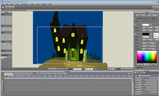
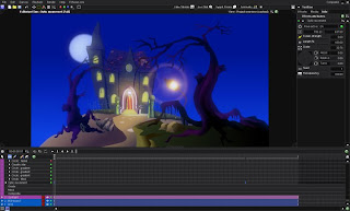
The most complicated part of the process was animating the house. I wasn't too concerned with the other objects in the scene as I didn't mind the trees etc appearing flat. The image below is of the final frame of the animation roughed in before various tweaks took place. You will notice that I zoomed the camera in too.
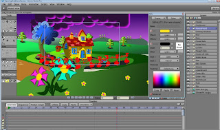

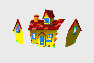
The house itself was constructed as below. The main part (front) was on one layer and the two sides on a separate two layers. I started by using the tools in Anime Studio (Perspective , Scale, Magnet, Move Point Tool etc) to get the house into it's final angle of viewing it from it's left side. The right side of the house is visible at the start of the shot but the left side is hidden beneath the front layer of the house. It was 'simply' a matter of scaling down the right side of the house and hiding it and scaling up the left side and revealing it as the house turned. There are surprisingly few keyframes involved.

Of course, for any other parts of the house where you see firstly the right side and then the left side I had to hide the left side at the start of the shot and reveal in a similar manner. A bit of point animation and tweaking and the final illusion seems quite effective.

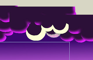
For the cloud lightning I simply created a few white shapes with blurred edges on a layer above the clouds and animated them fading in and out in sequence.


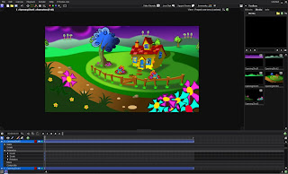
I rendered each element out separately from Anime Studio as an image sequence (Targa's) with Alpha Channel. Note that if you render out to a QuickTime file you will need to make sure you select a codec (such as Animation) that has 'Millions of Colours +. The '+' being the Alpha Channel. I render to Targa's as still images always look cleaner to me and automatically contain the Alpha Channel.

The elements were imported one at a time into my compositing software Vision Lab.


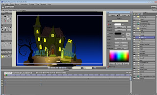
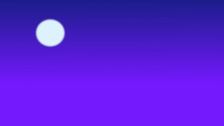
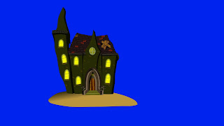
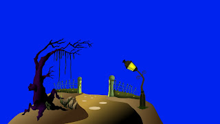
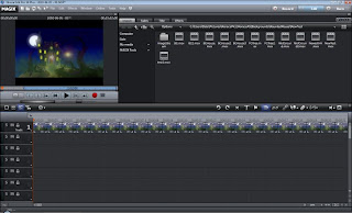
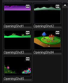
Below you can see the separate elements in the Media Pool as they imported into Vision Lab.


After adjusting colours a little and adding light spill around some of the elements and a bit of blur etc (especially on the foreground bank) I exported the composited animation as separate images again to be imported into VirtualDub and saved out as an Avi for use in my video editing software.


The final shot....


That's it for this time. If you have any questions please ask and I will do my best to answer.


All text and images (c) 2010 Dale Hemenway


Sunday, 11 July 2010

More Dog Stuff

In order to create the animation I require from the dog ie: long shots of him running around I had to have a 'turnaround' of him similar to the one created for the Flea a while back. I tend to create these for all my character's as it's a great starting point. If you do this before you produce your storyboard you can pose your character for storyboards too.

Anyway. I started with the side view and, in Anime Studio Pro, created a front view.


I loaded the front and side views into Artrage on separate layers and lined them up.


Next I used the pencil to roughly draw an 'inbetween' of the head. It brings back memories of my 2D cel animation days this part! =0)


Once the whole dog was inbetweened I moved on to the next position in the rotation which is inbetween the side and back view. The back view is the easiest to create as you can usually just remove the face and other details and tweak the feet.


Once all the inbetweens had been created the drawings were loaded into Anime Studio Pro and traced. The individual parts were then put back together as shown below.


Of course I also had to do a rotation of the Flea House too as it was to be hanging from the dog's collar.


This is the completed Turnaround.


Below are three subsequent passes of animation starting with a rough blocking out and finishing with an almost completed animation.


All text and images (c) 2010 Dale Hemenway


Saturday, 5 June 2010

Haunted House

I'm a big fan of Hammer Films and the old Universal Horrors. It was only natural that I would, at some point, pay homage to these two huge influences on me.

This shot features a track towards a Haunted House. A few years ago I created a Haunted House in 3D so I used this as my starting point and traced it in Anime Studio.


I still have the door and door archway to trace in the above image. As I wanted to track towards the house I needed the various parts of the scene on separate layers so I could move them independently. I ended up with this.


It wasn't really satisfactory. It looked okay in my original storyboard sketch but now it looked wrong. I didn't like the tree and the streetlamp looked too modern. The gargoyle at the doorway wasn't right either.

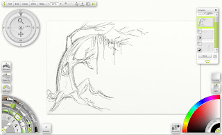
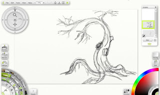
Time to load up Artrage and, with a line of action as a starting point, I used the pencil to roughly sketch out a couple of trees and gargoyles.


These were loaded into Anime Studio and traced and filled.
Eventually I ended up with four scene elements on separate layers ready for compositing. Incidentally, I didn't worry too much about the colours of the individual elements for creating a depth effect (the further away parts of a scene get the less saturated and more blue they appear) as I knew I could adjust this in the compositing software.


I could have rendered out stills and imported these into the compositing software for animating but I decided to animate the camera in Anime Studio and render out 4 separate animations. This enabled me to animate the tree branches blowing in the wind too. Once I was happy with the animation I started loading the elements into VisionLab.


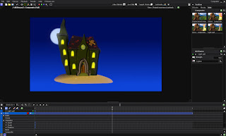
In the image above the first two elements have been loaded. I used a Light Spill filter on the house layer to add the appearance of light bleeding around it's edges from the moon behind.

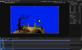
Next to be imported was the mid ground layer. Here is how the project appears when it's first imported.


In order for the other layers to show through I needed to make the blue of the background transparent.


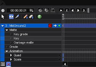
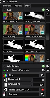
Under the Matte option I picked Key.


In the key filter options that opened I chose Colour Difference and selected Blue. After a little adjusting of the sliders the background was completely transparent. Now I needed to add some lighting effects.


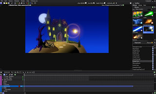
In the Effects Panel I chose Optics and dragged a suitable light onto the lamp post. This had to be animated as the lamp post was moving closer to the camera. A keyframe at the start of the move and another at the end sufficed.


I also added a similar light to the lantern over the door and a Spotlight to the doorway itself to add to the effect. Next the foreground tree was imported.


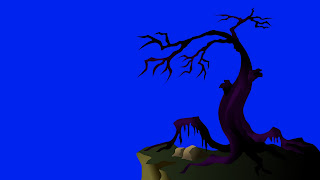
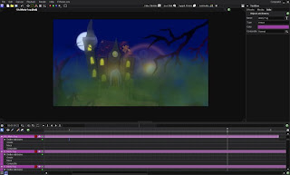
Under the Effects Tab I chose Particles and added three layers of spooky green fog. By the way, VisionLab is an excellent application and the company, FXHome, that created it are always enthusiastic and helpful. Most off the effects presets are created by users and free to download. The Green Fog, for instance, is a preset that was created by me several years ago for uses such as in this very shot.


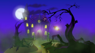
After a bit of tweaking the above image shows a frame as rendered from VisionLab. The frames were exported as Targa files and loaded into my editing software.


To finish I rendered out as a HD QuickTime Movie.


As always please feel free to comment or ask questions. See you soon.

All text and images (c) 2010 Dale Hemenway


Saturday, 17 April 2010

A dog, a flea and a home

Last time I showed you the Flea and mentioned a tutorial I'd written on 'Creating Characters for Animation in Anime Studio' using the Flea as an example. For those interested the tutorial is now available for download on the Smith Micro site here......

http://blog.smithmicro.com/cgi-bin/bblosxom.cgi/2010/04/06#100406_anime_studio_tutorial

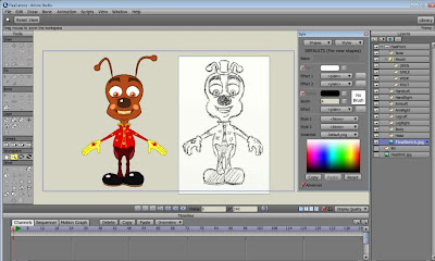
The Flea had to have a home and, although I designed one years ago made out of matches, I was never really happy with it. I don't think a Flea would go to the trouble of making a house but would just move into some toy house. I simplified the design and came up with this in Anime Studio for the front.


I then created the side view which was much simpler being just a wall, side of the roof and a copy and pasted window from the front. I created the Flea House in Anime Studio because, as it's hanging from the dogs collar, I need it to be animated at times.


For the opening establishing shot of the film I want to have the camera slightly rotate around the character's home. Not this Flea house you understand but the main character's home but I thought this would be a good opportunity to see if it could be achieved easily in this software. You can create 3D objects in Anime Studio but you really have to make them out of geometric shapes and, as you can see from the image above, this would have been quite difficult with my design. So, I decided on a different approach. I attached the side of the house to the front and then scaled and 'tucked' the side behind the front so it was completely hidden. I then used perspective and scale tools in Anime Studio to make the front appear to be turning to the left as I revealed the side moving out from behind and scaling up.


The final result seems to be quite convincing considering it's only two main keyframes (the start and end) and I'm looking forward to trying it out and hopefully improving on it a little for the opening shot of the film.


The dog, Scratchit, had again been designed and modelled a long time ago but looking at him again recently I thought he seemed too 'generic'. I doodled in my sketchbook until I came up with elements of a design that I thought worked. Below are some of those scribbles and doodles.


I sketched out the dog properly and loaded the sketch into Anime Studio and traced round it. Here you can see the various elements of the side view split apart and ready for adding bones.


I like dogs and enjoy animating them. I was lucky enough to be asked to animate the first in - game animations of the dog in the latest Lego computer game and was then given all of the dog animations to do from then on. He was the character I enjoyed animating most. Anyway, here is my dog being animated by manipulating the bones.


The great thing about Anime Studio is the way you can use a combination of bone and point animation to animate including scaling bones and moving points for squash and stretch. Exaggerated a bit here but you get the idea....


Here is a test animation I did of the dog running complete with imported Flea House attached to his collar.


That's it until next time. I hope you enjoy these posts. Let me know if you have any questions or comments.


All text and images (c) 2010 Dale Hemenway

Friday, 2 April 2010

Flea Run

Hi Everyone,

It's been a while hasn't it!? Things have gone crazy at work due to coming to the end of the new Lego video game which has left me shattered when I arrive home.

Apart from that I was asked by Smith Micro, the makers of the Anime Studio Pro software I use, if I'd do a tutorial for them. Obviously I was flattered that they asked me and also thought it'd be a good opportunity to show the whole process of creating characters in the software. I did greatly underestimate how long it would take me and the work involved however!

The manual features some great tutorials but it doesn't follow the whole process through for someone that wants to start at designing a character and end up with one they can animate fully and not just in the flat cut-out style.

Below is the test animation I did as an example to show what could be achieved. The tutorial will be up at Smith Micro next week I'm told. In the meantime I need to make the most of this Easter break and get some more stuff done to show you guys. Thanks for following .....and being patient =0)


(c) copyright 2010 Dale Hemenway
Saturday, 23 January 2010
New Character Mouth Shapes

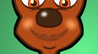
I've been creating a new character in Anime Studio. I've had a version of him for a long time but tried to develop him a little for this incarnation. I started with a rough sketch of a front view. This is the most boring view but I use this in AS as a starting point for creating 3/4 views and others.
The character was traced into AS using the vector tools. I rarely import images drawn in other software as, despite hearing of others complaints, I find the drawing tools in AS excellent.


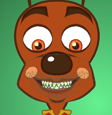
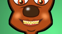
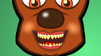
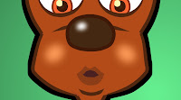
The mouth area including the whole lower part of the face is created on a separate layer so that lip sync keys can be drawn. In this instance I only needed a few shapes as the Flea never talks but mostly laughs and makes noises. Here you can get an idea of how the mouth was constructed.


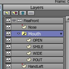
It might look complicated but it's not really. I had to create some shapes to hide those beneath. For example the dark inside of the mouth has a shape above it that contains the lips with an area around which is the same colour as the face so this acts as a mask to conceal the inner mouth that would otherwise show through. I next created a Switch Layer and placed the mouth inside. I copied this mouth layer a few times so that I could move points to produce the other mouth shapes required. Here is the layers palette showing the mouth shapes in the Switch Layer.


I ended up with these key shapes. Obviously for dialogue you would need a few more. New shapes can be added on the fly as the animation requires.


To create basic dialogue in AS it's simply a matter of advancing the timeline and 'switching on' the correct mouth shape for the sound on any particular frame. There are auto lip sync solutions included in the software but I don't use them. Next I turned on the 'smooth interpolation' option in the Switch Layer and rendered a quick test....


All text and pictures (c) 2009-2010 Dale Hemenway