Saturday, 23 January 2010

New Character Mouth Shapes

I've been creating a new character in Anime Studio. I've had a version of him for a long time but tried to develop him a little for this incarnation. I started with a rough sketch of a front view. This is the most boring view but I use this in AS as a starting point for creating 3/4 views and others.
The character was traced into AS using the vector tools. I rarely import images drawn in other software as, despite hearing of others complaints, I find the drawing tools in AS excellent.
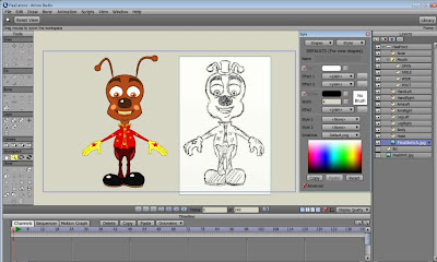


The mouth area including the whole lower part of the face is created on a separate layer so that lip sync keys can be drawn. In this instance I only needed a few shapes as the Flea never talks but mostly laughs and makes noises. Here you can get an idea of how the mouth was constructed.
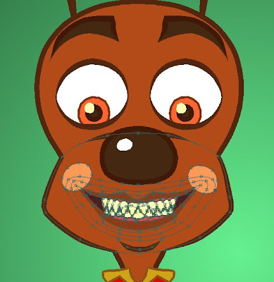


It might look complicated but it's not really. I had to create some shapes to hide those beneath. For example the dark inside of the mouth has a shape above it that contains the lips with an area around which is the same colour as the face so this acts as a mask to conceal the inner mouth that would otherwise show through. I next created a Switch Layer and placed the mouth inside. I copied this mouth layer a few times so that I could move points to produce the other mouth shapes required. Here is the layers palette showing the mouth shapes in the Switch Layer.
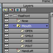


I ended up with these key shapes. Obviously for dialogue you would need a few more. New shapes can be added on the fly as the animation requires.
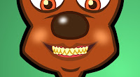
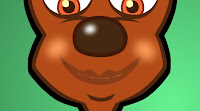
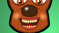
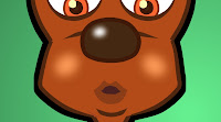


To create basic dialogue in AS it's simply a matter of advancing the timeline and 'switching on' the correct mouth shape for the sound on any particular frame. There are auto lip sync solutions included in the software but I don't use them. Next I turned on the 'smooth interpolation' option in the Switch Layer and rendered a quick test....


All text and pictures (c) 2009-2010 Dale Hemenway

Sunday, 10 January 2010

Lightning

Firstly, Happy New Year! =0)
New years are great as it feels like we can go forward with new optimism and enthusiasm. Speaking of which, it's been a little while since I posted here but it doesn't mean I haven't been working on this project. I don't want to post absolutely everything I do or there will be nothing new to see when it's completed.

Well, I had this very short shot to complete that consisted of a door swinging open to reveal the robot just as lightning flashed which scares Granny for a moment as she looks on. I chose a fairly dramatic upward view (almost from Granny's point of view) to make the robot appear even more foreboding. The first step was to create the background, without the door, at the required angle. This was roughed out in Artrage then completed in DrawPlus.


Next I posed my robot character in Anime Studio Pro and tilted the layer using the Rotate Layer XY tool and moved the camera until I had the correct view. It's a bit of a cheat but the shot is so short that I think it gives the impression I wanted. I exported the image as a large .png to preserve transparency.


Next I imported the .png into ArtRage and traced the character on a new layer in black to create a silhouette.


The door was animated in Anime Studio Pro once the background and character had been placed on layers. At this point I needed to create the lightning flash. I could have just done a few frames of white or even over exposed a few frames in my editing software. However, when I was younger I used to study animated films on a Super 8 editor I had which was useful as the film could be wound through the gate by hand a frame at a time. I learned a lot about animation in those days. It was almost impossible to do that with the advent of VHS but luckily it's again possible with DVD or BluRay. I remembered that I was fascinated all those years ago by a shot from Disney's Sleeping Beauty. It's right at the end where the Prince is fighting Maleficient and as she transforms into a huge dragon there is a dramatic flash of lightning. It's not just a flash of a few white frames though. Shown below is what I noted at the time. The frames are listed on the left and then you can see that the character is lit separately to the background over 16 frames!


I created a series of white and yellow silhouettes of the character in ArtRage and a set of layers with coloured backgrounds in Anime Studio. I placed these in Switch Layers so it was easy to alternate them during the animation.


Here is the finished shot. I rotated the camera (canted view) in order to disorient the viewer further. The additiuon of a thunder sound effect and the illusion is complete. Created by me....with a little help from Disney =0)


All text and pictures (c) 2009 Dale Hemenway